Showing posts with label quilts from art. Show all posts

Monday, December 10, 2018

Inspired by a Painting - A Quilt Gift


Sometimes a quilt takes time to evolve. This is one of those. Last year, we went to visit my son and his girlfriend. This was the first time I had met her. She is an artist and had a painting on the wall in their living room that I was really drawn to.


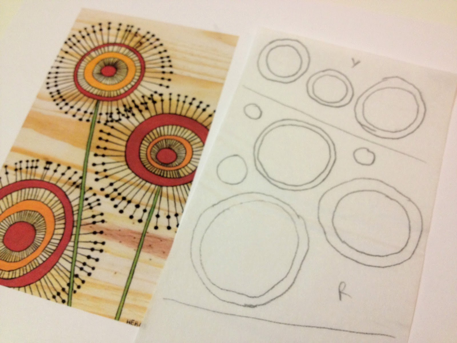
This was from a college class where the assignment was to paint something using only circles. I wanted to use the colors in this painting to make a quilt for them. The mixture of colors in the painting made me think about batik fabrics first, so a stash busting I went. In my head, I was going to do a literal translation with the color placement.


I did not have enough in my stash for that to work out and for some reason, I was sticking closely to the darkest of colors in the painting.


The next iteration had a few more medium tones added in and then came the experiment with pops of color. I had to look at this one a few days and finally figured out that it was because there were too many short scraps and no continuity of color anywhere. This was just too chaotic.


Then I finally got around to adding some lighter colors (honestly, the critique of my family is what it took to convince me to add the lighter colors), took out anything that was too floral or leafy, and continued to debate about whether or not to add the pops of color. There were other sewing projects mixed in to this process, but I bet this had been on the design wall for a month or more at this point. We went out of town for a few days.


This is what I came home to. I think our cat had a little bit of fun while we were away. It was time to start sewing or else this project was never going to be finished.


It wasn't until I started looking at this quilt vertically rather than horizontally that I thought maybe it was going to turn out okay. Maybe I would like it a little. To help it along even more, I decided to back it with a plush minky in navy. This was a first for me so I was nervous about quilting with a thick fuzzy backing.


I did a bit of reading for tips and learned that extra basting and using a larger size needle were essential to successful quilting. I use 505 basting spray for layering quilts and I was extra generous for this project. Both tips were very helpful. I kept the quilt design simple, using a large meander and then a rough outline of each triangle.


I knew there was no way I could accurately stitch around the outside of each triangle so intentionally went wonky with them. You can see a tiny bit of fuzz coming through on the lightest of the fabrics. That all but disappeared after the quilt was washed.


Here's another peak at the quilting.


The quilting shows up nicely on the back, too. I love the plush coziness of that backing.


The binding is machine stitched and is a lovely midnight blue batik. The girlfriend of a year ago is now a soon to be daughter-in-law. They were engaged last month and are planning a small spring wedding. I love my growing family.


The weather has been dreadfully wet and gray so I never got any great pictures of this quilt. It is now all wrapped up under the tree for them to open when they pass through on their way to visit other family this holiday season.


While this quilt is not at all what I pictured in my head when I first started making it, it evolved into a warm and cozy gift that will always remind me of the first time I met my soon to be daughter-in-law.

Monday, February 8, 2016

Quilts Inspired By Art: Goodbloom Week Two


This is our second week working with this art print by Goodbloom. Check out last week's post for an introduction to this month's project. I decided to go with a close replica for my first project. That meant I would be studying the piece closely so that other inspiration could hit while focusing on the details of the print. And other inspiration definitely hit. I'll show you the second project in progress after we talk about this one.


For the red, green, and yellow, I used the same fusible applique technique we learned last month. After printing the art in a 4x6 format, the shapes were easy to trace.


The next step is to press the fusible to the wrong side of the fabric.


I did a test run of the applique pieces. It looked a bit plain to me. At this point I decided to do the quilting before the applique.


I needed to give myself some quilting boundaries and this lid was the perfect size. I traced around it for each flower.


It took a bit to get into the rhythm of the design but once I got going it went quickly.


Now that all the black quilting is complete, it's time to add the applique pieces.


Since this is a piece that is not likely to be washed, I could have fused the pieces and called it finished, but I decided to go ahead and quilt them to be sure they would stay in place. Some neutral quilting in the background and some binding finished it off.


Here is a closer picture of the quilting. Wouldn't this be pretty with black seed beads instead of the free motion dots?


Another up close shot.


The finished piece is 6 inches by 8 inches or so. I like the center. I'm on the fence with my binding choice and I need more practice binding small projects. There are a couple of wavy spots but overall I am happy with it.

I was ready to dive right in to the second project once this one was finished.


Those black and white fabrics kept catching my eye. I was determined to include them. This next project is a little more traditional. I started by cutting 2 1/2 inch squares.


At first, I was attempting a more random design, but ended up moving to this very traditional trip around the world look. There was no red in the beginning either, but it definitely needed it. There are several different beige prints to keep it from being too boring and also because I did not have enough yardage of a single fabric. I thought the black and white stripes distracted from the overall quilt.


I like it much better with the more dominant black fabrics. No more stripes. The design is 10 squares by 11 squares so without borders it will be 20 inches by 22 inches. I will decide about a border after it is stitched together.

For next week I'm hoping to have this inspiration piece finished and hopefully have one more underway to share.


I hope you are enjoying this exploration of quilts inspired by art. I can't wait to see what next week brings!

Linking up with Monday Making at Love Laugh Quilt and Design Wall Monday at Patchwork Times. Also linking up with Whoop Whoop at Confessions of a Fabric Addict and Finish It Up Friday at Crazy Mom Quilts.

Monday, February 1, 2016

Quilts Inspired By Art: Introducing Goodbloom


Hello! Welcome to the second month of quilts inspired by art. This month our inspiration comes from this print created by Holly Bartos. I found this print on Pinterest and tracked it down to Holly by way of her Etsy shop goodbloom. Holly has been on hiatus from her Etsy shop for a while, but a note there says that she intends to reopen in early 2016. That is great news. Holly describes her art as retro and whimsical.

I loved this piece of art for a quilt because it offers so much opportunity for techniques, sizes, and interpretations. It would make a perfect fabric postcard, a cute miniquilt or wall hanging, and could also be made as a block that is repeated for a bigger quilt.

Let's break down the pieces of this print. First, the background.


Wait. Let's take a brief pause and do a little clean up. I'm not as far along with this project because the first step was to look at the cream and tan colors of the background and this was the state of my cream and tan fabric.


A few hours later we were in much better shape and can easily find what we need. I have been slowly organizing my fabric into these drawers and this is one of the last sections that needed cleaning up. Nothing like a project for a little motivation!

There are several options for creating the background, which is an actual piece of wood.


I pulled a good selection of light to mediums. These could be improv or strip pieced to form a background similar to the print. Or, a print that contains most of the tones could be used as a single piece. It would be a different look but remember, the original art is an inspiration. We are not necessarily trying to replicate it.

The flowers are primarily red, orange/yellow, and black.


Here is the complete pull. The flowers could be cut shapes that are appliqued to the background or they could be layered with black fabric behind them. The black lines and dots could be machine quilted or hand stitched with embroidery. There are lots of options with this piece and I'm hoping to explore several of them throughout the month.


While there isn't any black and white in the art print, I pulled these because of the line and circle pattern that is similar to those in the flowers. We will see if they make it to any of the finished projects. I was also thinking about doing a cool color version with grays, blues, and greens.


Next week I'll have some sample tops and blocks put together to share along with instructions for how to create one of your own.

Linking up with Monday Making at Love Laugh Quilt and Design Wall Monday at Patchwork Times.

Monday, January 25, 2016

Quilts Inspired By Art: Hello Baby Girl Version


It's a girl! Girl quilt, that is. This is our last week working with our first art and craft inspiration piece, a greeting card made by Linda Aarus of Polka Dots and Paper.


Here is the inspiration card and if you need to catch up to how we got to where we are today, here are the posts from prior weeks:


I tried to use some different techniques on this version of the quilt so you could better see some of the options. 


A traditional machine blanket stitch is used to secure each of the letters in place for this quilt. For the quilting, there is an all over flower design that covers the entire quilt except for the area with letters.


The flowers are even quilted into the borders.  There is an inch or two of unquilted space right around the outside edge of the quilt.


The quilting was fun once I got past some thread breaking issues. Changing the type of bobbin I was using helped with that. It could have something to do with my machine needing a good cleaning, too.


The quilting shows up good from this angle.


Here they are side by side. Boy version. Inspiration card. Girl version. I think we have success. I do not have a pattern to offer for this project...yet. It is a work in progress and I will let you know as soon as it is ready. You have all you need in the posts from previous weeks to make one of your own if you decide to go ahead and get started.

Our inspiration piece for next month is an art print that I found on Pinterest and tracked down the artist through Etsy. Hope you'll join me next week for another fun month of Quilts Inspired by Art.

Linking up with Monday Making at Love Laugh Quilt and Design Wall Monday at Patchwork Times.

Monday, January 18, 2016

Quilts Inspired By Art: Hello Baby Week Three


We have a finished quilt! Welcome to the third week of the first project in our Quilts Inspired by Art series. If you are joining us for the first time this week, check out how we got here:

Week One: Introduce the Inspiration Art for the Month and Discuss Fabric Options
Week Two: Cutting and Piecing Instructions for the Quilt Top
Week Three: That's This Week!

This week, we'll be learning how to add lettering to our quilt top along with options for quilting the quilt.


Here is the original greeting card that inspired this quilt. It comes to us from Linda Aarus at Polka Dots and Paper.


This is where we left off last week. Borders have now been added and it is time to add letters. Since this is intended to be a quilt for a baby or young child, I wanted a fitting word. "hugs" seemed like just the right word for this quilt.

ADDING LETTERS


To audition letters, use your computer and any word processing software to try out fonts and sizes. To stay true to our inspiration art, the letters are similar in size. The font is different only because the simpler the font, the easier it is to apply to the quilt. I tend to like simple fonts better anyway.


To make sure the letters line up nicely, mark a straight line for the bottom of the letters to sit on. I used a blue water soluble pen for my line.


Use a fusible product to adhere the letters to the quilt. Keep in mind that the fusible will go on the back of the letters. This means the letters need to be reversed. I turned over my printed pages and outlined the letters with a pen so the reverse letters could be seen good enough to be traced.


The fusible product I am using is Steam A Seam 2 Lite. Since there is paper on both sides, lift up a corner to determine which side has the "glue". The glue side will be rough. Be sure to draw on the paper that has the rough side underneath.


Trace the reversed letters on the fusible paper. Do not cut out the letters yet. Cut around them enough so they will fit on your fabric. Peel the paper (the one without the rough feel) and lay the letters on the WRONG side of the fabric. Wrong is emphasized only because it is a common error to accidentally iron the fusible to the right side of your fabric, which is wrong. Ha. Follow the manufacturers instructions for your product to iron the fusible to the wrong side of your fabric. Now, cut out the letters.


Do one more dry run with your letters to make sure you are happy with the placement.


Carefully peel the paper off the back of each letter and place it on the quilt.


Remember how I used a blue water soluble pen to make a line for my letters? Well, that needs to be removed before any final pressing begins. If you don't, pressing can sometimes make those water soluble lines permanent. I used a spray bottle to wet the area and let it dry. Again, fuse the letters to your quilt according to the instructions with your fusible product.


The fusing is not permanent so the letters need to be secured with stitching before the quilt is washed. There are two primary ways to do this. The first way is to stitch them down before the quilt top is layered and quilted. Many traditional quilts use a blanket stitch for this, but any stitch will work as long as the edges of the letters are stitched to the quilt. The other way is to stitch them down during the quilting, which is what I did for this project.

QUILTING SUGGESTIONS

The quilting options always seem endless. An all over design would be nice on this quilt, either straight line or free motion. I'm going to try that with the second version of this quilt (which you will see shortly), but for this version, it is quilted in zones. That means there is different quilting in each area of the quilt.


For the print and the red fabric that make up the horizontal and vertical stripes in the quilt, I used straight lines a half inch apart in coordinating thread.


The blue background is quilted with large circles except around the word "hugs" where the circles are smaller to form a "cloud" around the word and also to help secure the letters to the quilt. The red border is quilted with straight lines and the outer border alternates between a large circle and straight lines.


The quilting is a little easier to see from the back of the quilt.


The final quilt represents its inspiration art quite nicely. I consider this quilt to be the boy version.


Here is the girl version. The top is complete. This one is going to have "xoxo" instead of a word. The quilting will be an all over free motion flower design. I'm hoping to share it in finished form next week.

In three short weeks, we've made it from idea to finished quilt. Next week will be our final week on this project. We'll take one more look at our quilts as compared to our inspiration art and I'll roll out this project in pattern form. In February, it will be time to take on a new art inspiration piece.

Linking up with Design Wall Monday at Patchwork Times and Monday Making at Love Laugh Quilt. Also linking up with Fabric Tuesday at Quilt Story and Work in Progress Wednesday at Freshly Pieced.
Related Posts Plugin for WordPress, Blogger...