Showing posts with label quilt inspiration. Show all posts

Monday, January 18, 2016

Quilts Inspired By Art: Hello Baby Week Three


We have a finished quilt! Welcome to the third week of the first project in our Quilts Inspired by Art series. If you are joining us for the first time this week, check out how we got here:

Week One: Introduce the Inspiration Art for the Month and Discuss Fabric Options
Week Two: Cutting and Piecing Instructions for the Quilt Top
Week Three: That's This Week!

This week, we'll be learning how to add lettering to our quilt top along with options for quilting the quilt.


Here is the original greeting card that inspired this quilt. It comes to us from Linda Aarus at Polka Dots and Paper.


This is where we left off last week. Borders have now been added and it is time to add letters. Since this is intended to be a quilt for a baby or young child, I wanted a fitting word. "hugs" seemed like just the right word for this quilt.

ADDING LETTERS


To audition letters, use your computer and any word processing software to try out fonts and sizes. To stay true to our inspiration art, the letters are similar in size. The font is different only because the simpler the font, the easier it is to apply to the quilt. I tend to like simple fonts better anyway.


To make sure the letters line up nicely, mark a straight line for the bottom of the letters to sit on. I used a blue water soluble pen for my line.


Use a fusible product to adhere the letters to the quilt. Keep in mind that the fusible will go on the back of the letters. This means the letters need to be reversed. I turned over my printed pages and outlined the letters with a pen so the reverse letters could be seen good enough to be traced.


The fusible product I am using is Steam A Seam 2 Lite. Since there is paper on both sides, lift up a corner to determine which side has the "glue". The glue side will be rough. Be sure to draw on the paper that has the rough side underneath.


Trace the reversed letters on the fusible paper. Do not cut out the letters yet. Cut around them enough so they will fit on your fabric. Peel the paper (the one without the rough feel) and lay the letters on the WRONG side of the fabric. Wrong is emphasized only because it is a common error to accidentally iron the fusible to the right side of your fabric, which is wrong. Ha. Follow the manufacturers instructions for your product to iron the fusible to the wrong side of your fabric. Now, cut out the letters.


Do one more dry run with your letters to make sure you are happy with the placement.


Carefully peel the paper off the back of each letter and place it on the quilt.


Remember how I used a blue water soluble pen to make a line for my letters? Well, that needs to be removed before any final pressing begins. If you don't, pressing can sometimes make those water soluble lines permanent. I used a spray bottle to wet the area and let it dry. Again, fuse the letters to your quilt according to the instructions with your fusible product.


The fusing is not permanent so the letters need to be secured with stitching before the quilt is washed. There are two primary ways to do this. The first way is to stitch them down before the quilt top is layered and quilted. Many traditional quilts use a blanket stitch for this, but any stitch will work as long as the edges of the letters are stitched to the quilt. The other way is to stitch them down during the quilting, which is what I did for this project.

QUILTING SUGGESTIONS

The quilting options always seem endless. An all over design would be nice on this quilt, either straight line or free motion. I'm going to try that with the second version of this quilt (which you will see shortly), but for this version, it is quilted in zones. That means there is different quilting in each area of the quilt.


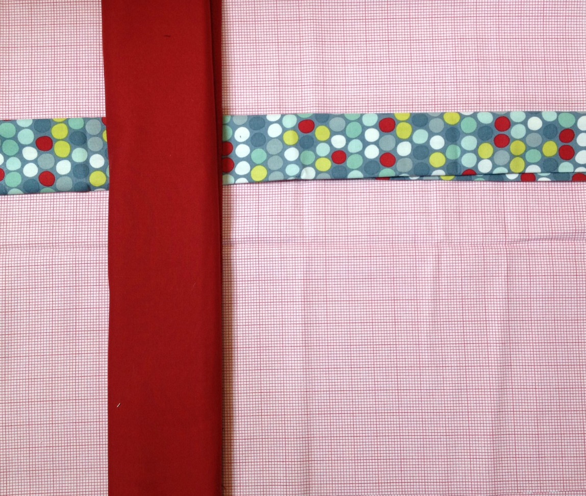
For the print and the red fabric that make up the horizontal and vertical stripes in the quilt, I used straight lines a half inch apart in coordinating thread.


The blue background is quilted with large circles except around the word "hugs" where the circles are smaller to form a "cloud" around the word and also to help secure the letters to the quilt. The red border is quilted with straight lines and the outer border alternates between a large circle and straight lines.


The quilting is a little easier to see from the back of the quilt.


The final quilt represents its inspiration art quite nicely. I consider this quilt to be the boy version.


Here is the girl version. The top is complete. This one is going to have "xoxo" instead of a word. The quilting will be an all over free motion flower design. I'm hoping to share it in finished form next week.

In three short weeks, we've made it from idea to finished quilt. Next week will be our final week on this project. We'll take one more look at our quilts as compared to our inspiration art and I'll roll out this project in pattern form. In February, it will be time to take on a new art inspiration piece.

Linking up with Design Wall Monday at Patchwork Times and Monday Making at Love Laugh Quilt. Also linking up with Fabric Tuesday at Quilt Story and Work in Progress Wednesday at Freshly Pieced.

Monday, January 11, 2016

Quilts Inspired By Art (And Craft): Hello Baby


Welcome to week two of the first project in our series, Quilts Inspired By Art. This week we are cutting and piecing our quilt top. If you missed last week's post, go check it out.


This greeting card, made by Linda Aarhus of Polka Dots and Paper, is our inspiration. I think the quilt top looks very close to the inspiration piece. The scale of the print is a lot smaller but in general, this project is on the right track

Last week, we talked about choosing fabric and the yardage requirements needed to make this quilt. This week we are going to finalize our pattern, cut our fabric, and piece the quilt top.


While it looks like the basket weave effect might be complicated, it is really simple if the design is broken down into rows. Here it is translated to a pattern. There are three fabrics and seven rows in the body of the quilt. The light gray is the background; the dark gray is the vertical stripe; the white is the print horizontal stripes.

CUTTING INSTRUCTIONS

Light Gray Background
Cut one 15 1/2 inch strip from the width of fabric
From the strip, cross cut
one 22 1/2 inch piece
one 5 1/2 inch piece
Cut one 6 1/2 inch strip from the width of fabric
   From the strip, cross cut
one 22 1/2 inch piece
one 5 1/2 inch piece
Cut three 2 inch strips from the width of fabric
From one strip, cross cut
two 15 ½ inch pieces
four 2 inch pieces
From one strip, cross cut
one 22 ½ inch piece
one 6 ½ inch piece
one 5 ½ inch piece
From one strip, cross cut
one 22 ½ inch piece
one 6 ½ inch piece
one 5 ½ inch piece
Dark Gray Vertical Stripe
Cut three 5 inch strips from the width of fabric
From one strip, cross cut
two 15 1/2 inch pieces
    From one strip, cross cut
one 15 1/2 inch piece
three 6 1/2 inch pieces
   From one strip, cross cut
five 5 inch pieces
six 2 inch pieces
White Horizontal Stripe
Cut three 5 inch strips from the width of fabric
From one strip, cross cut
one 5 ½ inch piece
one 8 inch piece
one 22 ½ inch piece
From one strip, cross cut
one 5 ½ inch piece
one 8 inch piece
one 22 ½ inch piece
From one strip, cross cut
one 11 ½ inch piece
one 28 ½ inch piece
Inner Border
Cut five 2 1/4 inch strips from the width of fabric 
Outer Border
Cut five 3 1/2 inch strips from the width of fabric 
PIECING INSTRUCTIONS

The piecing is very simple. The most difficult part is making sure each piece is in the correct place and turned the right way since some of the pieces are very close in size. Check carefully before sewing. All seams are ¼ inch wide.


All of my cut pieces are laid out and ready to be assigned to a row.


As each row was arranged, I kept this ruler close by to verify measurements for pieces that were similar in size.

Row One


     5 ½, 5, 2, 5, 2, 5, 22 ½

All pieces are cut 6 ½ inches wide for this row. The cut length of each piece is listed under the picture of the row. Arrange the pieces and sew together as shown. For row one, press seams toward the dark gray.

Row Two


      5 ½, 5, 8, 5, 22 ½

All pieces are cut 5 inches wide for this row. The cut length is listed under the picture.
Arrange the pieces and sew together as shown. For row two, press seams toward the white (or print).

Row Three


       5 ½, 5, 2, 5, 2, 5, 22 ½

All pieces are cut 2 inches wide for this row. The cut length of each piece is listed under the picture.
Arrange the pieces and sew together as shown. For row three, press seams toward the dark gray.

Row Four


       11 ½, 5, 28 ½

All pieces are cut 5 inches wide for this row. The cut length is listed under the picture.
Arrange the pieces and sew together as shown. For row four, press seams toward the white (or print).

Row Five

Repeat Row Three.

Row Six

Repeat Row Two.

Row Seven


       5 ½, 5, 2, 5, 2, 5, 22 ½

All pieces are cut 15 ½ inches wide for this row. The cut length is listed under the picture.
Arrange the pieces and sew together as shown. For row seven, press seams toward the white (or print).


Here are my rows all ready to sew. There was only room for the first six on my cutting table so I stitched those together first, then laid out and stitched the last row.


Oops. There is a mistake on row two. I was a bit of a smarty pants and was not checking the pattern closely enough as I was stitching. It is easy enough to correct. Those first two print pieces need to be swapped.

That is much better. Once your rows are completed, sew them together and press the seams. I pressed toward the row with the least amount of seams.


Now, to add the borders. I decided to stick with the color plan of the inspiration card and used the dark (red) for the first border. Measure the sides of your quilt and cut your borders to length. You will need to piece the borders for the top and bottom to have enough length. I added the side borders first, then the top and bottom.

I have not added the second border to my quilt yet. I really like the pop of color the outer border adds to the inspiration card, and I did not have enough of anything on hand. There will be a shopping trip happening in the next day or two to take care of that. I did have some scraps on hand to experiment with.

This light blue goes nicely with the lightest blue dot in the print fabric.


This citron green goes with the print fabric as well. I am leaning toward this color. It definitely pops.

What's up for next week? We will talk about adding lettering to our quilt top (I haven't decided if I want to add any letters to mine yet), and quilting options. I'm hoping to have a finished quilt to share with you, and maybe even a very girly color variation.

Thanks for following along.

Linking up with Design Wall Monday at Patchwork Times and Monday Making at Love Laugh Quilt. Also linking up with Fabric Tuesday at Quilt Story. More link ups with Work In Progress Wednesday at Freshly Pieced.

Monday, January 4, 2016

New Series: Quilts Inspired By Art (And Craft)

Welcome to a new blog series all about making quilts inspired by other mediums of art and craft. Each month we will start with a new inspiration piece and walk through the process of moving from inspiration to finished quilt. The plan is to post a new segment each Monday morning. You can make your own version along side me each week, or simply enjoy reading along.

This month's inspiration is from the scrap booking world. I am often inspired by unique layout and color choices for scrapbook pages and card design.

INSPIRATION


Linda Aarhus from Polka Dots And Paper provides our January inspiration. I could make a whole mini-quilt series from her Christmas card designs alone.This is the card that will be our inspiration this month. The basket weave layout, the ability to personalize, and the mix of print and solid are the primary factors that drew me to this card design. Kept to a relatively small scale, I thought it would be the perfect baby or child's quilt.


The first step is to calculate the fabric requirements and choose fabric. In my day job, I sit at a computer all the time and I am sure there is an easier way to do this. Sometimes, I think I was born a generation too late. I enjoy the process of ruler, paper, and pencil to figure out the measurements.

FABRIC REQUIREMENTS

Using the colors from the inspiration card:

  • Light Gray Background - 1 yard
  • Dark Gray Vertical - 1/2 yard
  • Print Horizontal - 1/2 yard
  • Inner Border - 1/3 yard
  • Outer Border - 1/2 yard
  • Lettering - 1/3 yard (This will depend on number of letters and size of letters, but 1/3 yard should cover most scenarios. We will learn about this in greater detail later in the month.)
  • Backing - 1 3/4 yards
  • Binding - 1/2 yard

This project does not work well with fat quarters. If you don't mind having extra seams in some of your pieces, it is possible, but it is not preferred. The instructions provided assume you are working with 40+ inch wide cotton fabric yardage.

FABRIC SELECTION


The next step is to choose fabric. My intention is to create these quilts primarily from my existing fabric stash. We will see how that goes. I also wanted to make a boy version and a girl version of this quilt. This was the first choice for boy fabric.


For this design, it is easy to layout the fabric in the general arrangement to get a better idea of how it will look.


I also tried a layout with the dots as the background, then realized that there wasn't enough yardage for that option. The red background is the one I liked best, but I knew not to move forward with that choice right away. It always helps me to take a fresh look after a few hours. When I took a fresh look, that distinct red and white graph paper fabric looked pink. There are some people who would be just fine with pink in a boy quilt, but most would not. Time to try again.


I had already selected a fabric for the back of this quilt. It was the perfect blue/gray/green match for the spot fabric.


This layout is the one I decided to use. The solids will offer lots of quilting options when we get to that step. The color is more accurate in the first layout with the red background. It is really a more blue/green than gray. The weather has not been cooperative lately for daylight pictures. Now for the girl option, which came together much more easily.


Can't get much more girly than this.


This layout seemed too busy to me.


This is better, although I may switch which fabric is horizontal and which is vertical. There is still time to ponder that. The boy quilt will be made first.

NEXT WEEK

Next week, we will talk about how to dissect an inspiration piece for quilt making. We will also cut our fabric and piece the top. I'd love to hear from you. This is my first time attempting a series and your feedback will only make it better. Questions and comments are always welcomed. I will do my best to respond to each and every one.

Linking up to Design Wall Monday at Patchwork Times and Monday Making at Love Laugh Quilt. Also linking up with Main Crush Monday at Cooking Up Quilts.
Related Posts Plugin for WordPress, Blogger...